Project overview
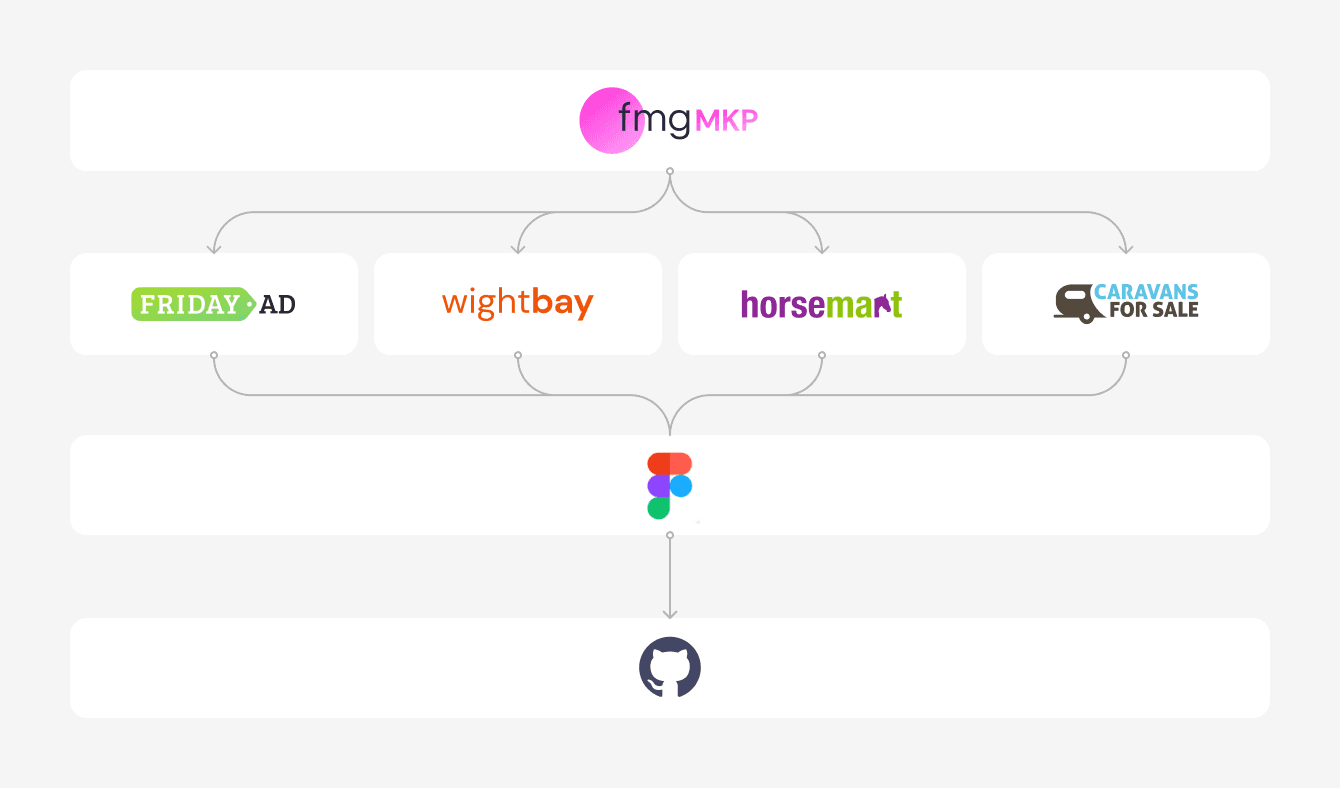
During 3 years, I have been the UX/UI designers in charge of the Friday Media Group Marketplace division (fmgMKP). In the division there are 4 main marketplaces brands belongings to different target markets. Due to business needs, in 2021 they were merged under the same division, fmgMKP, and from here we started a process to unify the experience, development and managing of all the sites; maintaining theirs distinguish characteristics.
My primary focus revolved around find a strategy to make the process as simple as possible, then design the UI components in Figma that could be scalable to each brand, and monitor and ensure successful implementation of the design system. The final aim of the project was to convert all UI component in tokens, for a scalable, consistent, efficient and consistent user interfaces across multiple brands or sub-brands within a larger organization.
Project goals
Create a cohesive and consistent design language aligned to all MKP brands, unifying some UI and UX elements and fundamentals.
Integrate design tokens into the design-to-development workflow and improve collaboration between design and development teams.
Research & Strategy
Reduce complexity
Each brand has its own personality and characteristics that need to be maintained. However, our goal is to speed up the process using common patterns and components. So, the first step was reorganize the entire Figma library structure by merging all the basic components into dedicated folders.
The process
Establishing design foundations
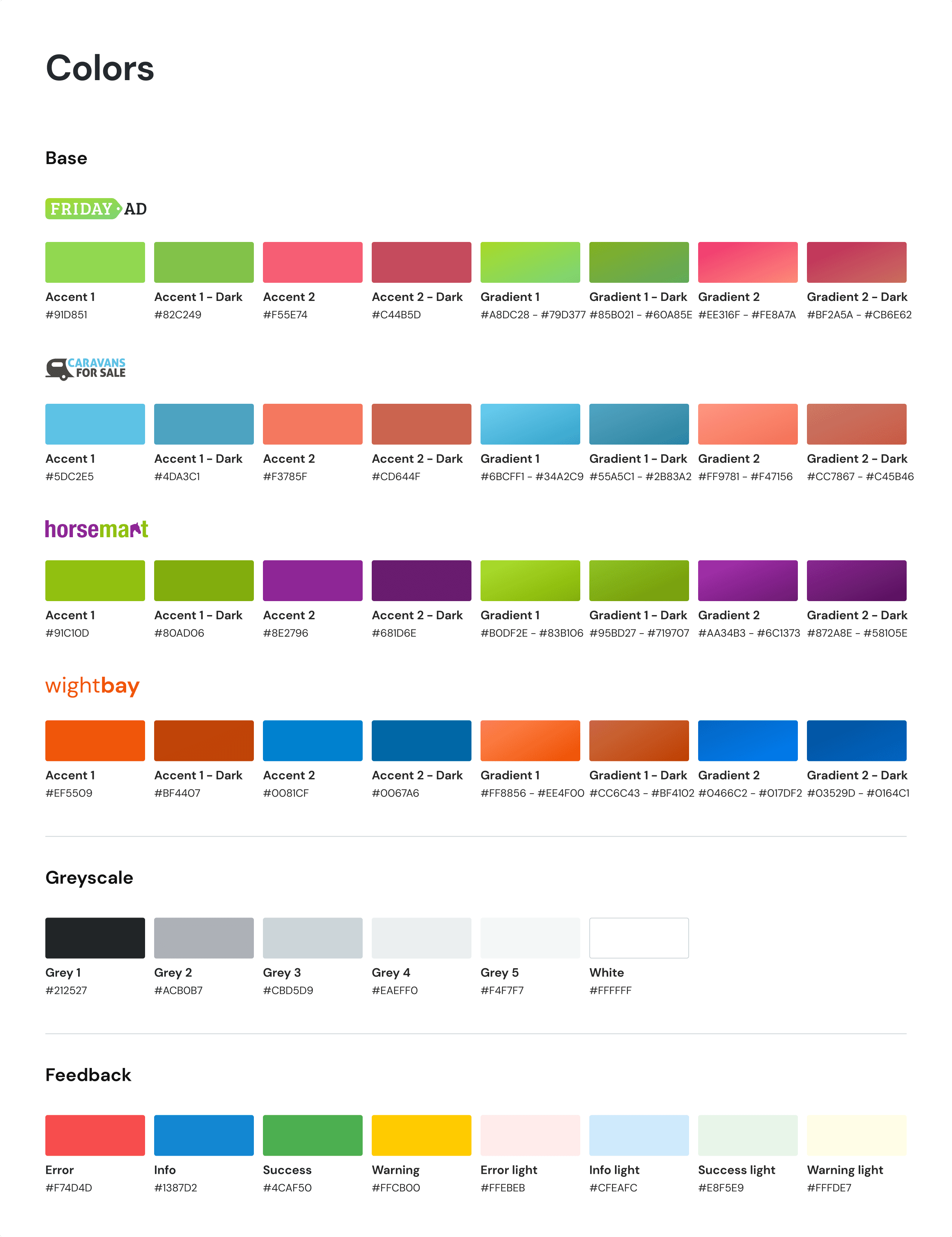
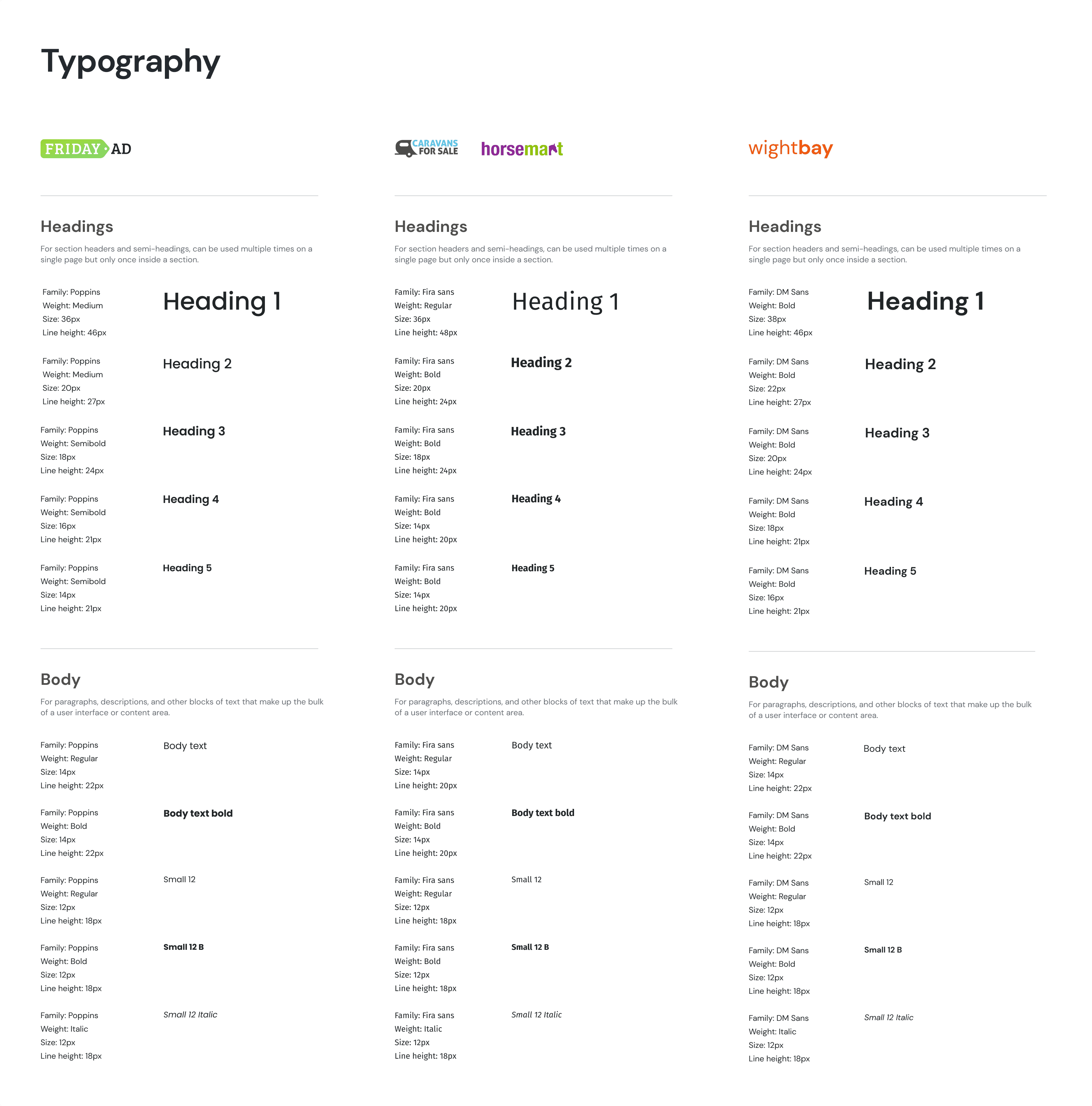
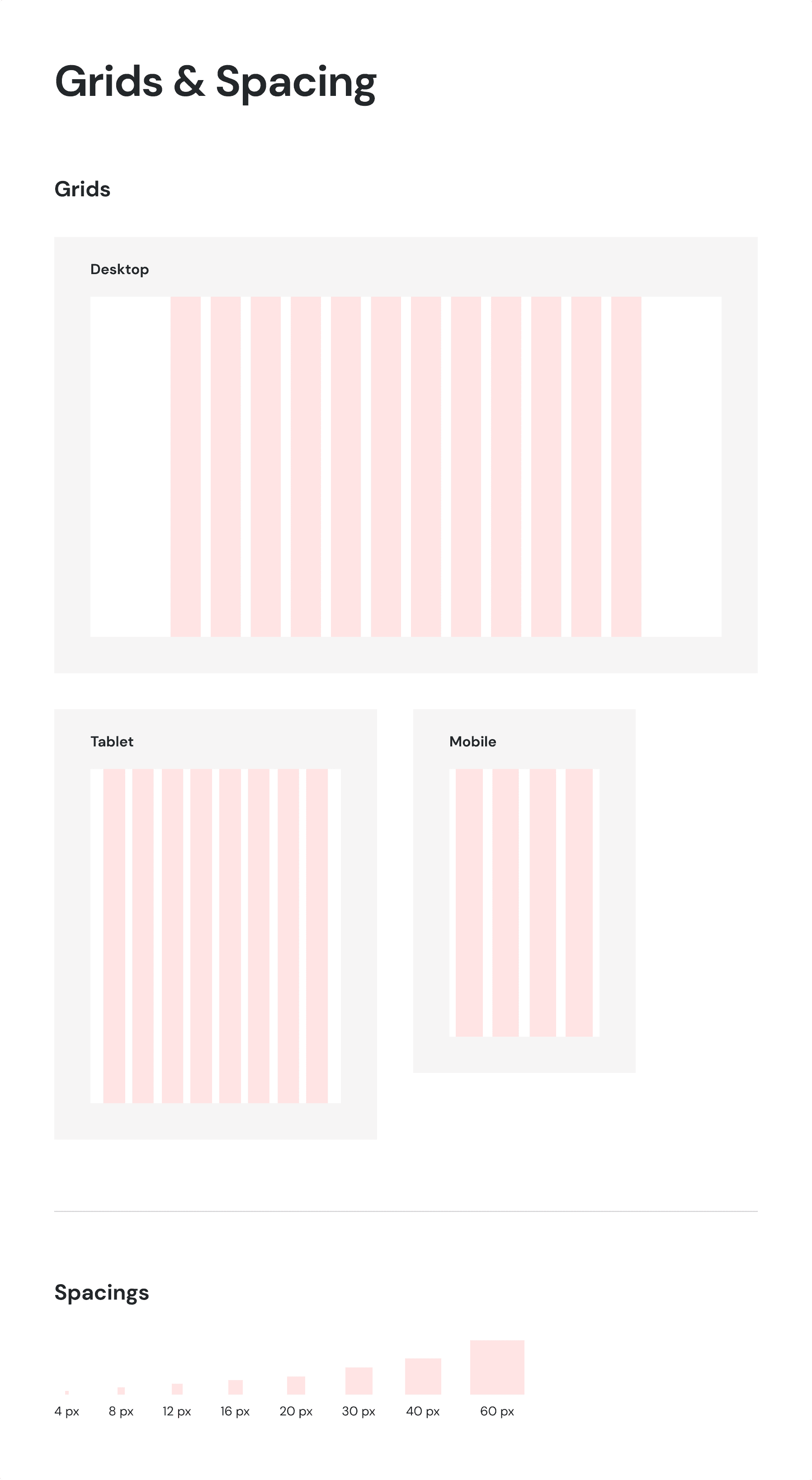
We started by setting up the design foundations. Grayscale and feedback colors, spacing, and grids were unified for all brands. I ensured each brand's color palette and typography follow the same pattern, with the same declination and names.
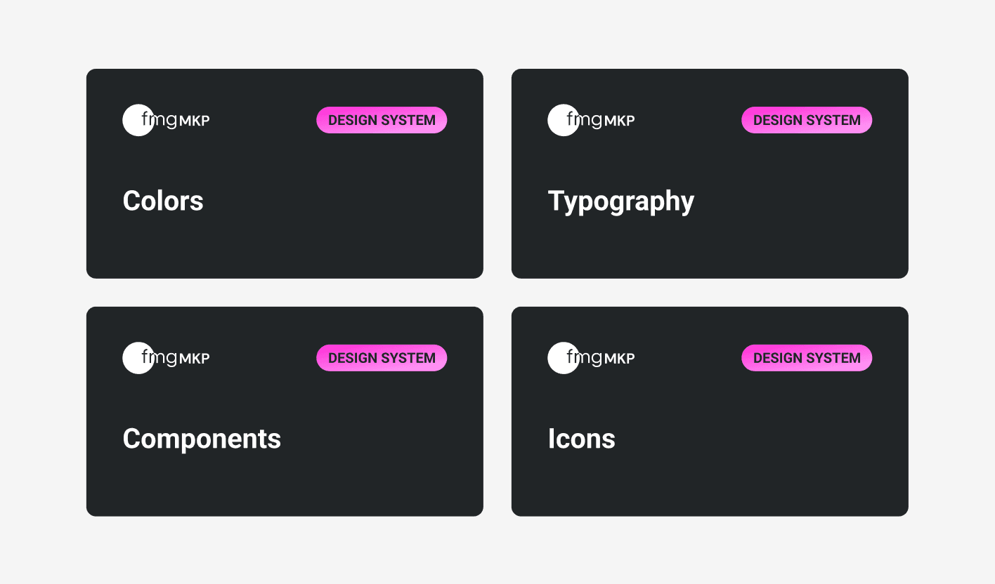
The repository also contains information about sizing, border radius, border width, various effects, and unified iconography. With this documentation, we can ensure that design decisions and implementation are clear and consistent.
Creating the component library
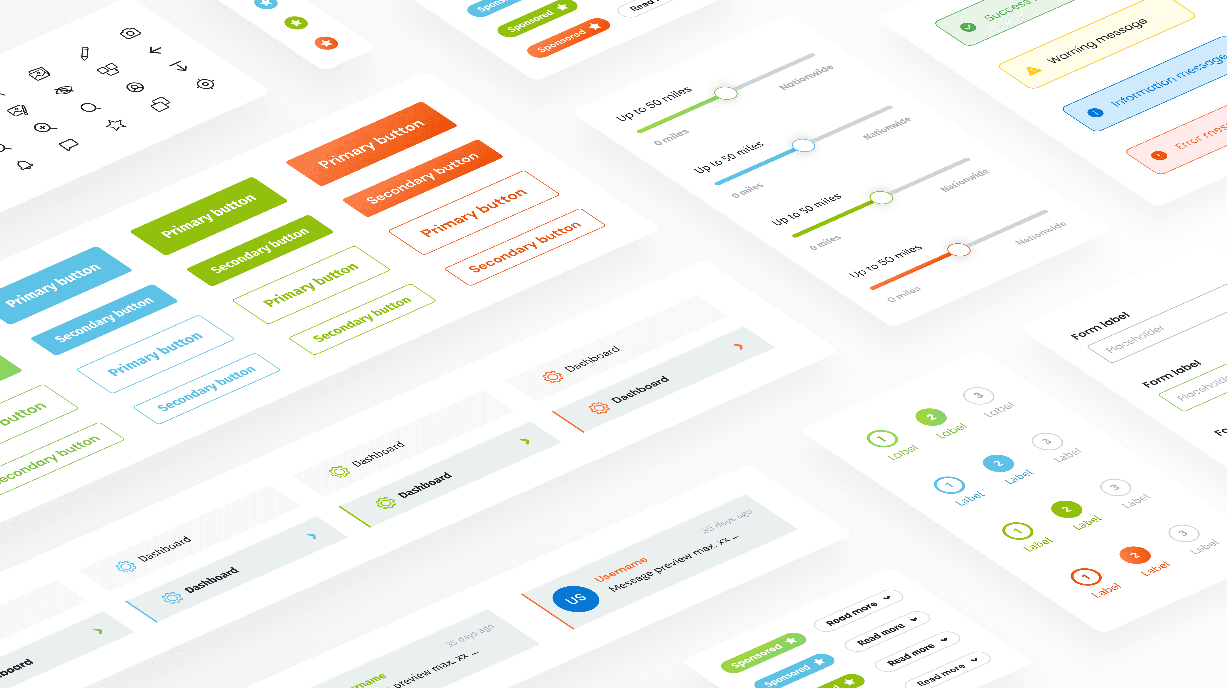
In order to build complex and scalable collections, I first created the base components (buttons, inputs, controls, etc.). I then moved on to larger components (cards, lists, accordions, etc.).
This is an example of a Card component with some variations:
Product Views
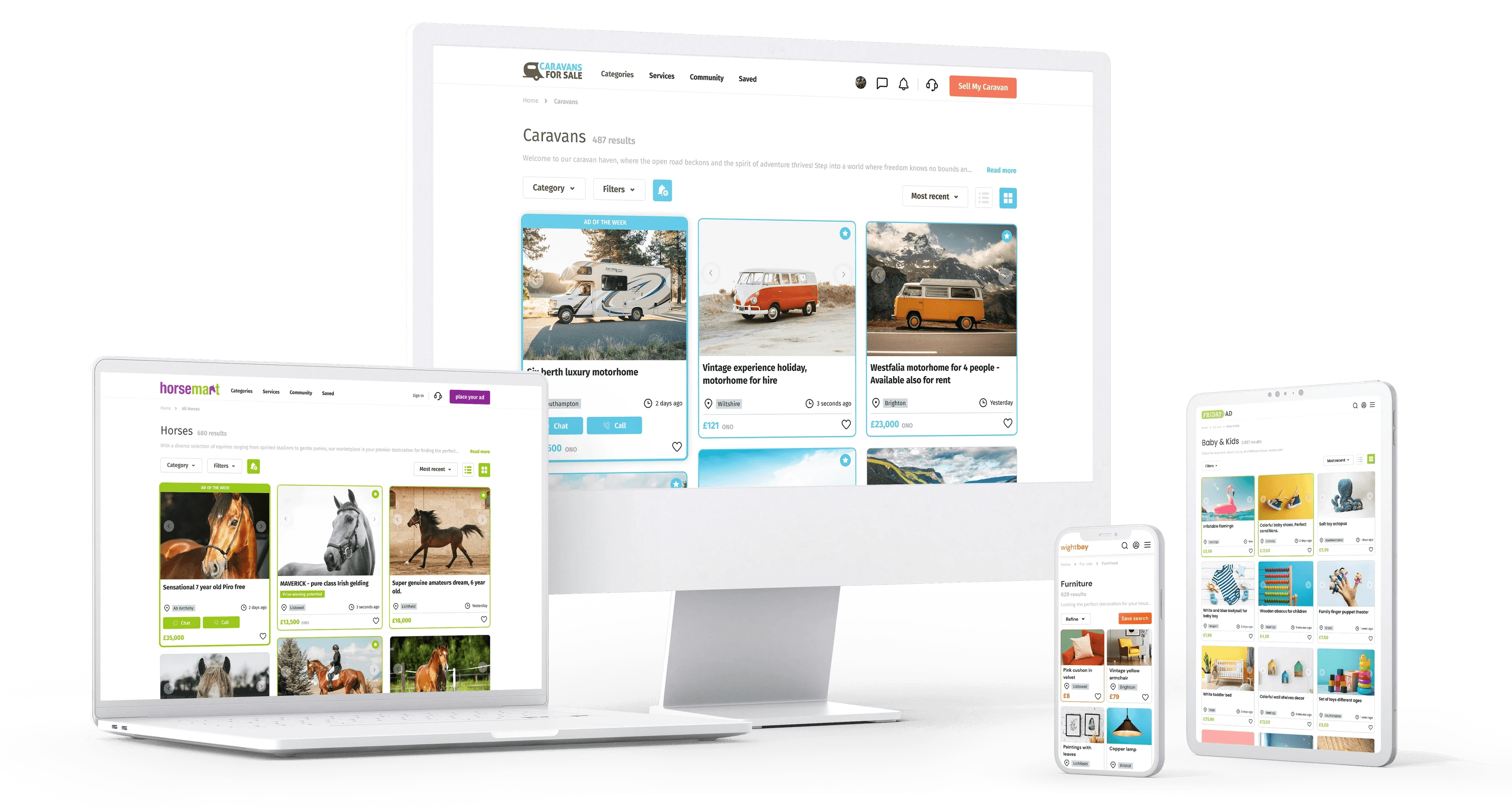
The new components are incorporated into the design to determine whether it works across platforms and brands, and to test the design system.
Styleguide
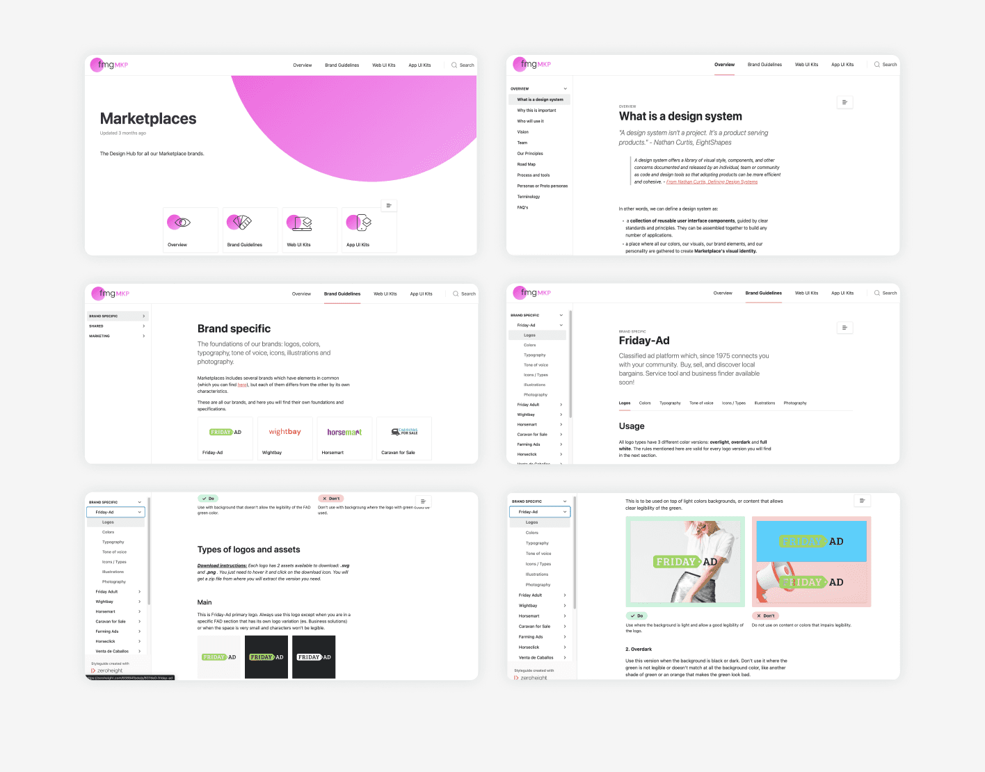
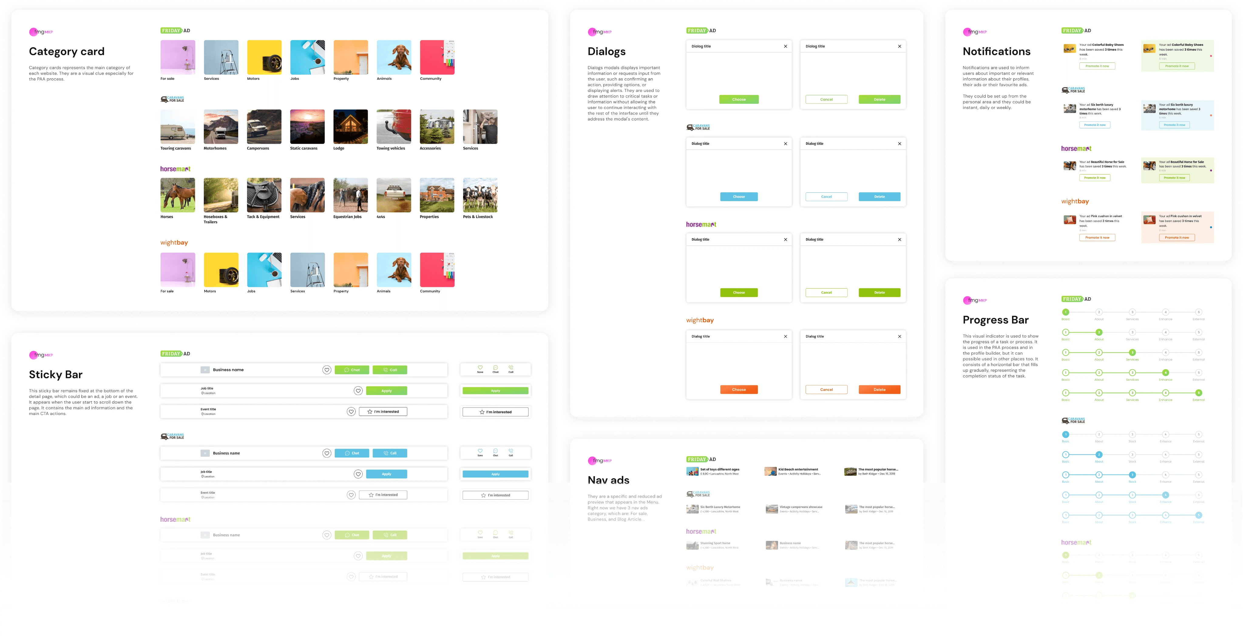
I created some guidelines with explanation about various styles and components, to facilitate both designers and engineers.
Documentation
In addition to the Figma guidelines, it was necessary to communicate the usage and status of the Design system development to the entire team, stakeholders and marketing included. In order to make these guidelines public and contain all the necessary information, I created them in Zeroheight.
Conclusions
We found that the UI kit helped a lot to speed up the design process across all brands. The first strategic part concerning the organization, and the design foundation part were the most challenging and slow ones, due to some strategic decisions we needed to make.
Due to the unified design foundations and improved organization, the design workflow quickly improved after this phase.
Because of a lack of resources, we were unable to create a token repository for developers, so we couldn't turn this UI Kit into a complete Design System. In general, this project brought a lot of improvements to the developer team as well, and certainly improved collaboration between the two teams.
