Project goals
This project aimed to unify the UI of the website and the app while introducing new features and renewing sections. To reach this goal, I had to create cohesive visual elements that match the brand's aesthetic across all platforms. As part of this project, a new icon set was designed and the tone of voice maintained and enhanced.
App UI
Icon design
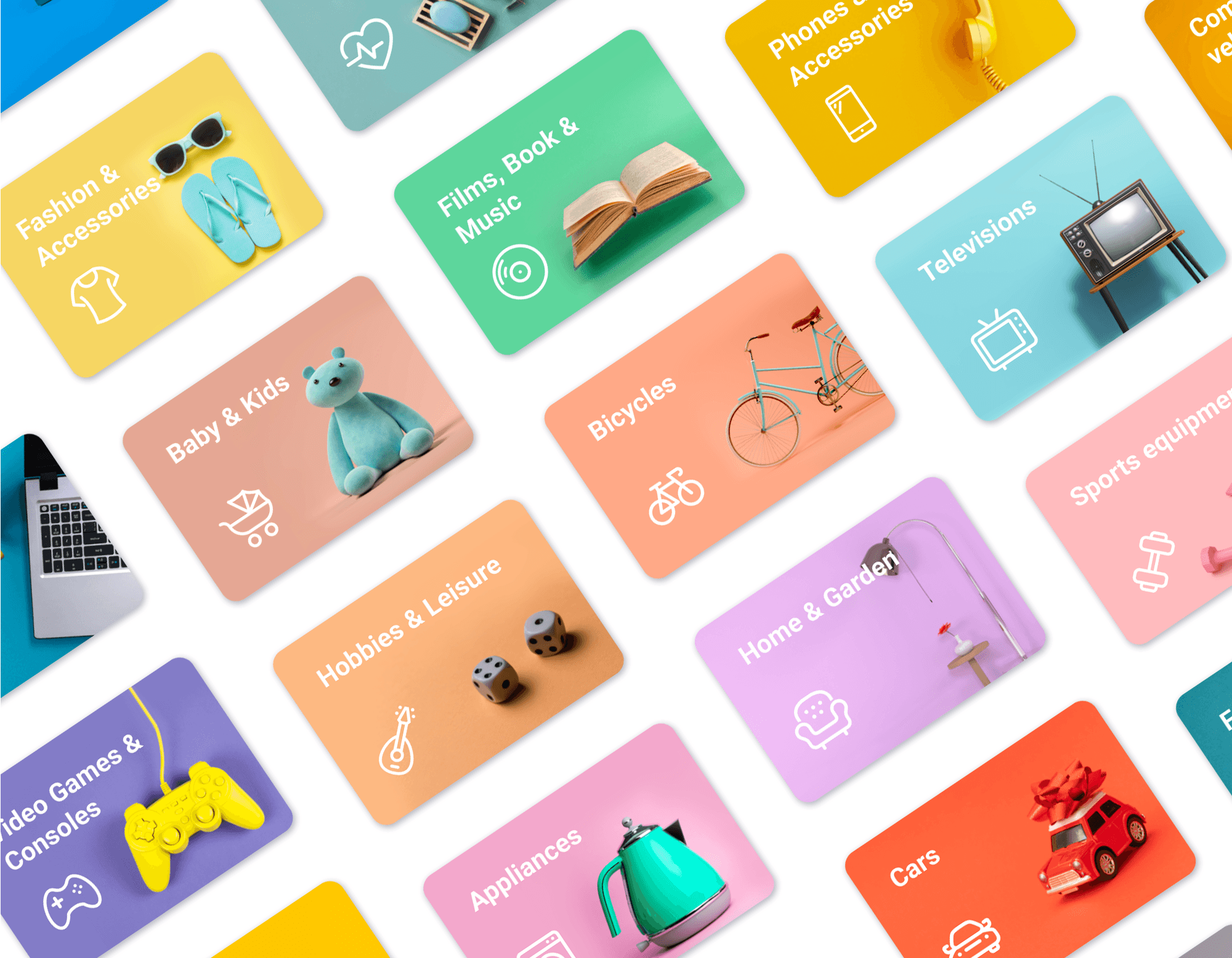
During the creation of the app, which initially only featured the "For Sale" category, we decided to subdivide this broad category into more specific ones. We established these new categories through a card sorting exercise, using the most popular items on the Friday-Ad site. These are the existing icons:

For Sale

Motors

Services

Property

Animals

Events
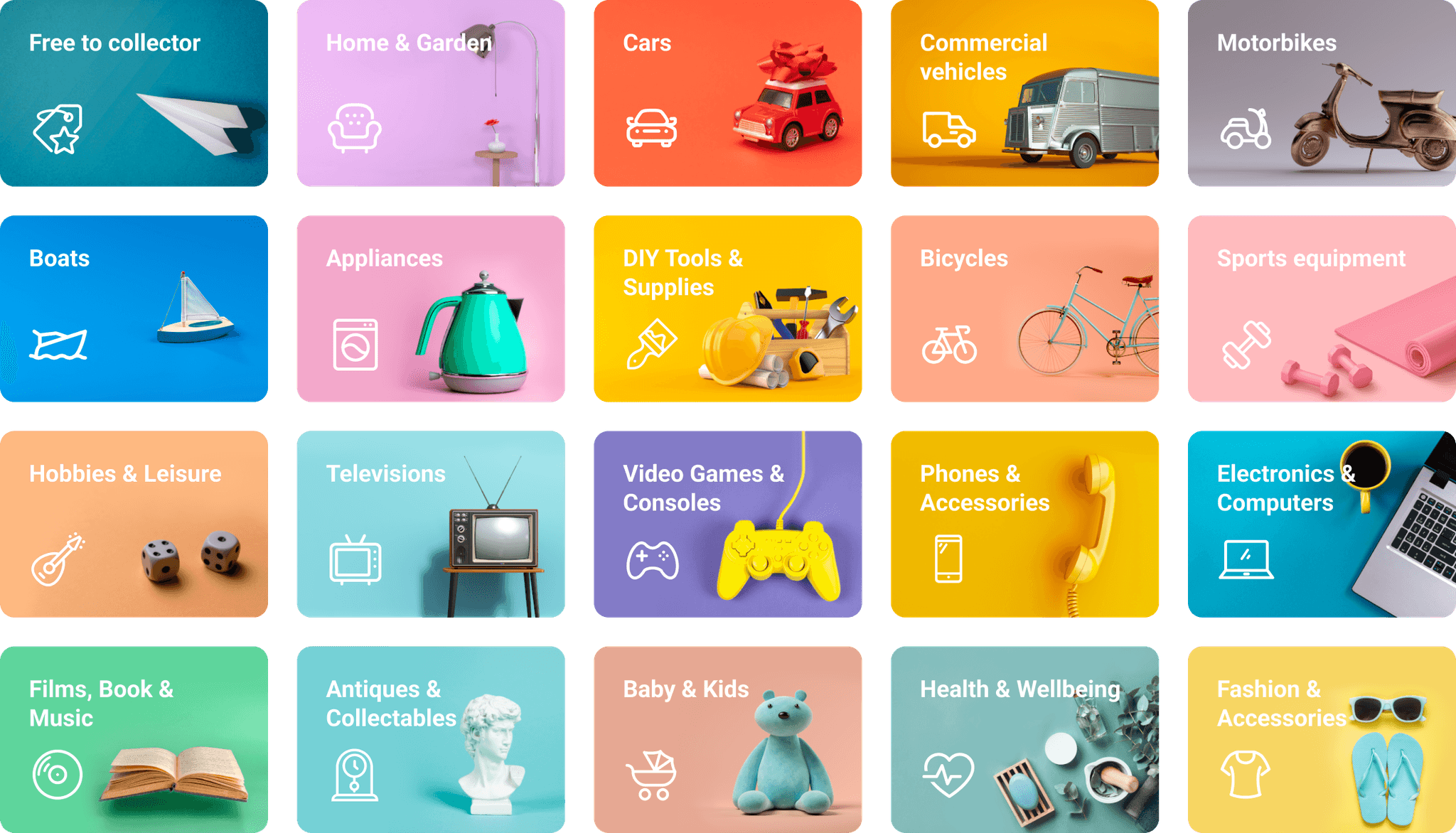
Maintaining the same style, I created the following new icon set for the app's updated categories:
For each icon, I followed the same grid and thickness, ensuring they were visually balanced with one another and making visual adjustments as needed.
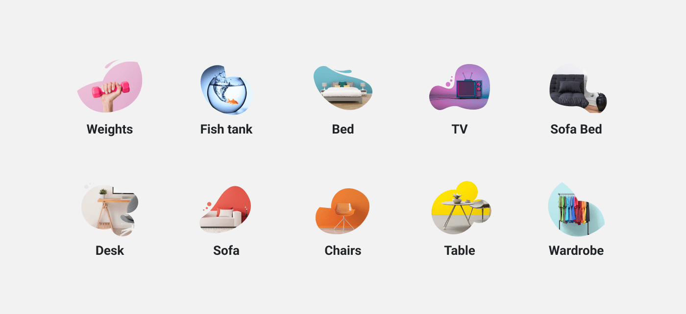
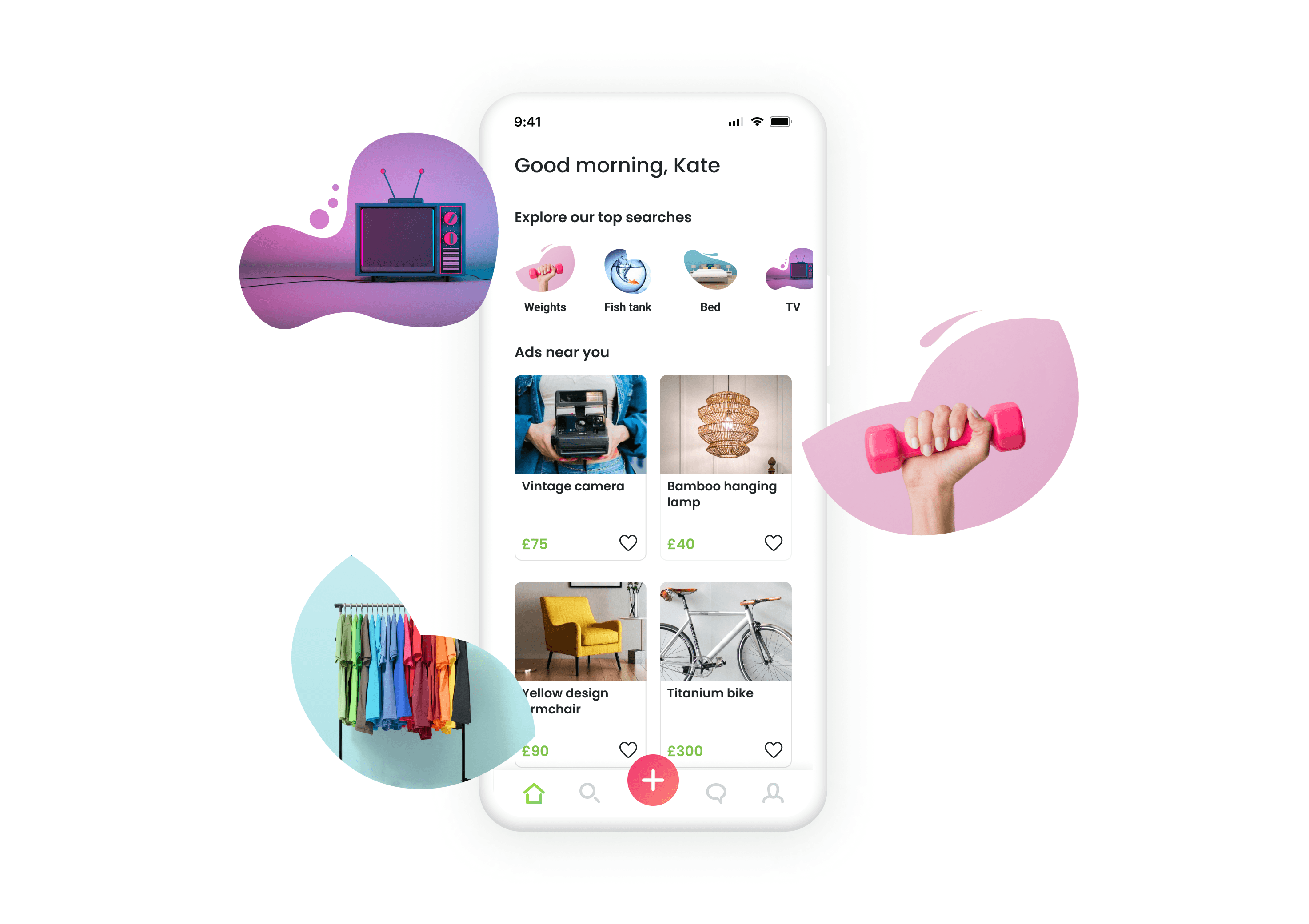
Top searches shortcuts
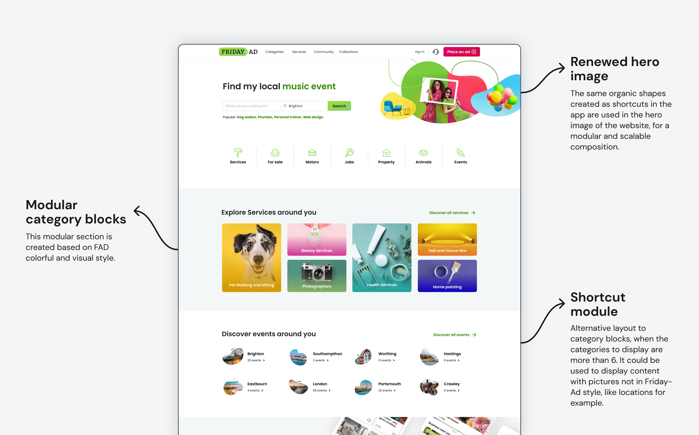
Starting from the need for a carousel on the homepage to highlight the most searched items, I designed these shapes to create a more dynamic and playful impact.
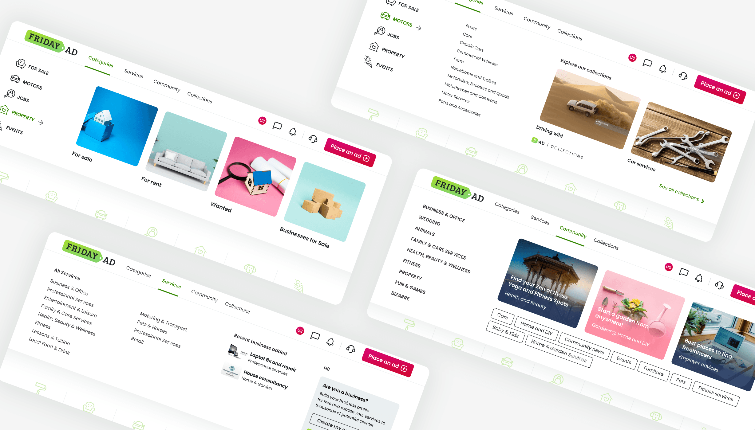
The megamenu has also been redesigned. It has been expanded to full screen, with all subcategories visible, and enriched with visual elements that align with the brand's identity.
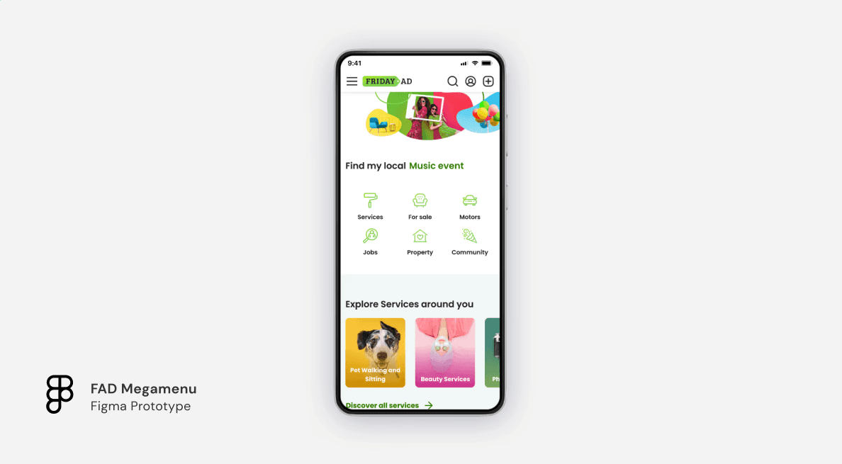
Interactive prototype for mobile navigation:
Conclusions
This project was a major step in unifying and modernizing the user experience for both the app and website. In addition, I realized how valuable a simple icon can be to a brand, how crucial it is to keep the big picture in mind especially with more products in different phases, and how essential it is to have a common language reinforced by clear guidelines. Friday-Ad's revamp successfully maintained its unique tone of voice and created a modern, vibrant marketplace that's still popular with UK users.
