Concept
The Logo
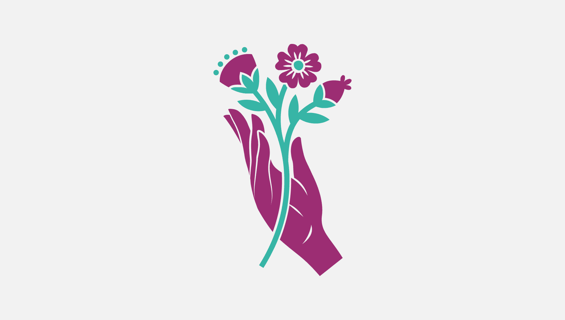
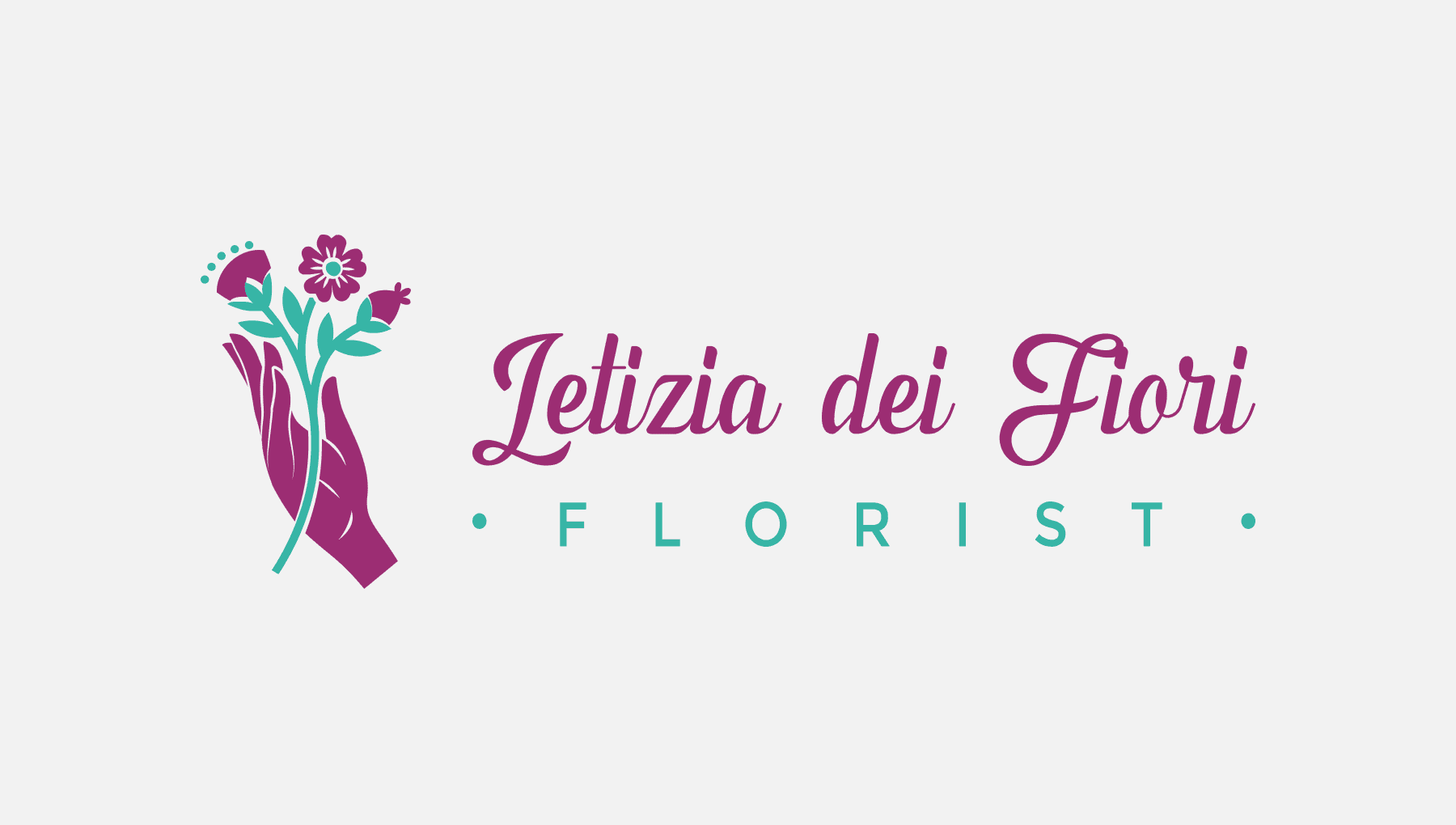
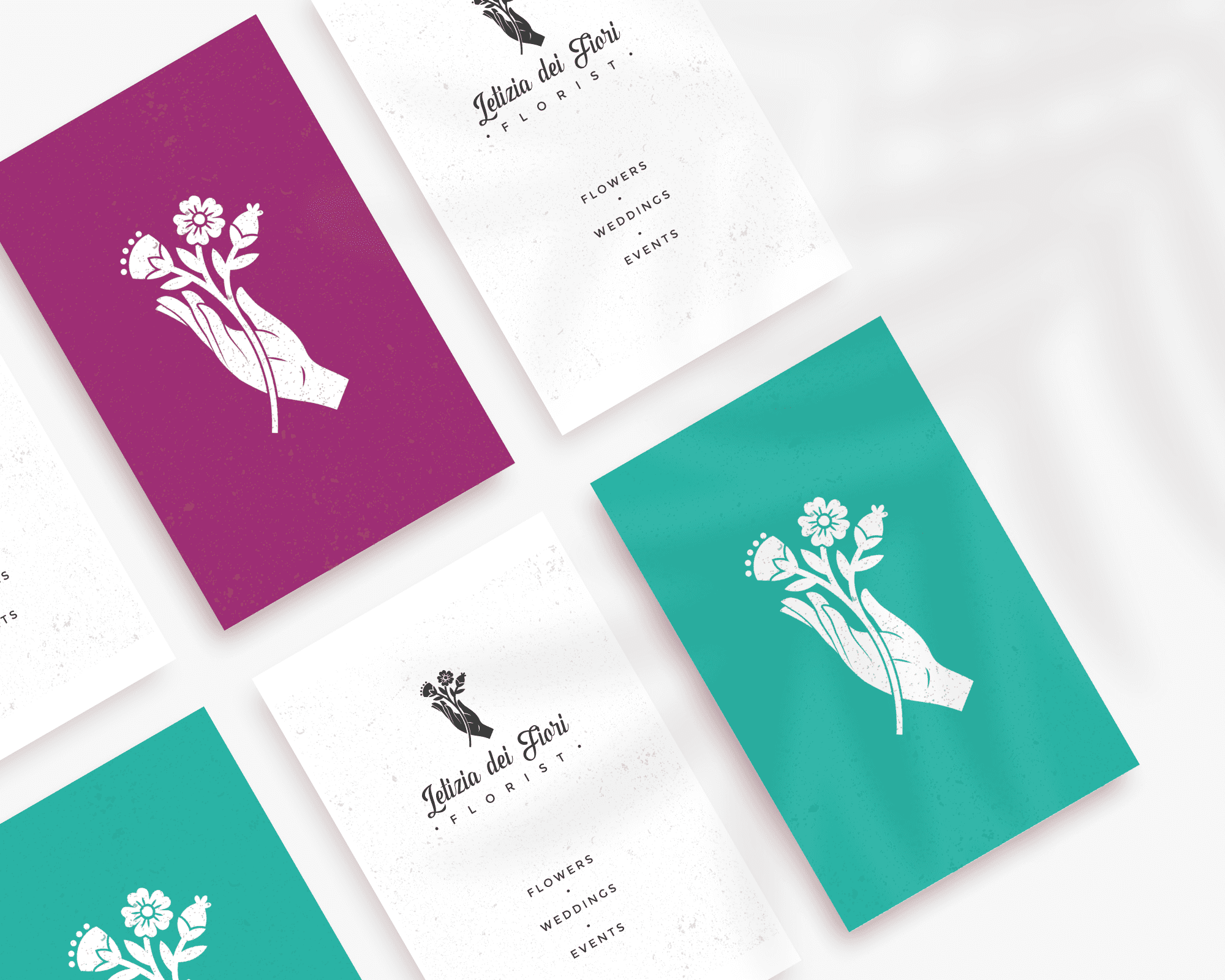
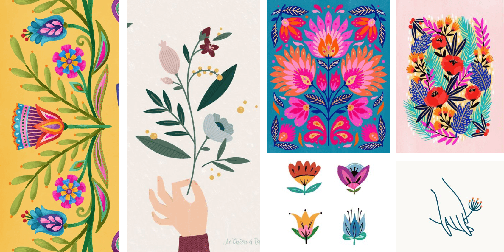
The logo combines the two concepts mentioned above, with strong colors and defined shapes which are a reference to folk art, and the hand holding flowers represents Letizia's unique and personal creations.
Colour Palette
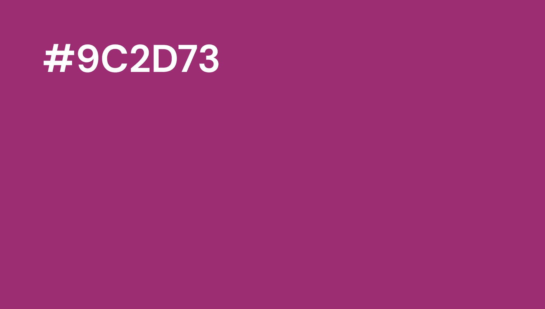
For the color palette, I combined purple and aqua green, which create a strong contrast between them.
Typography
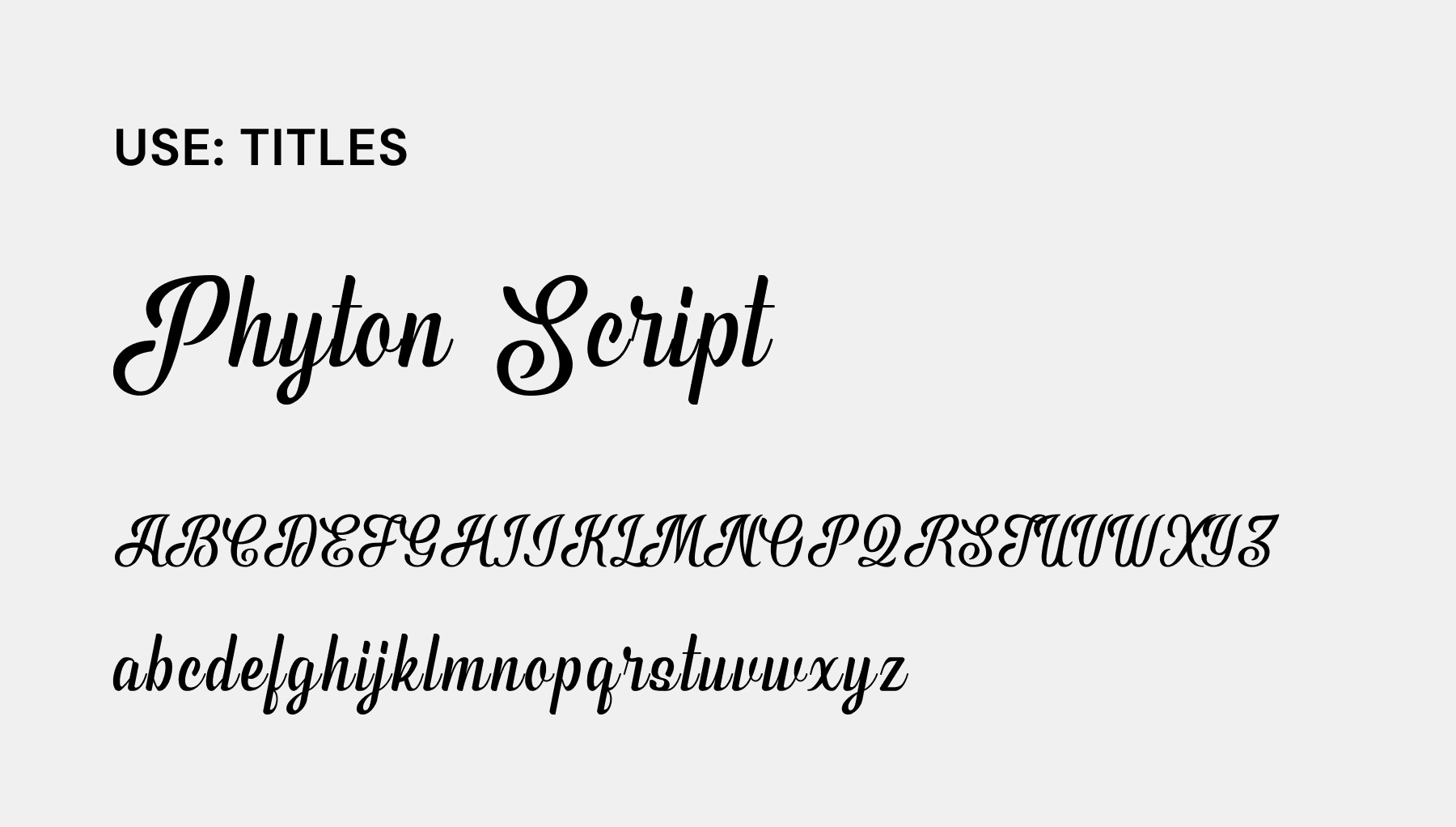
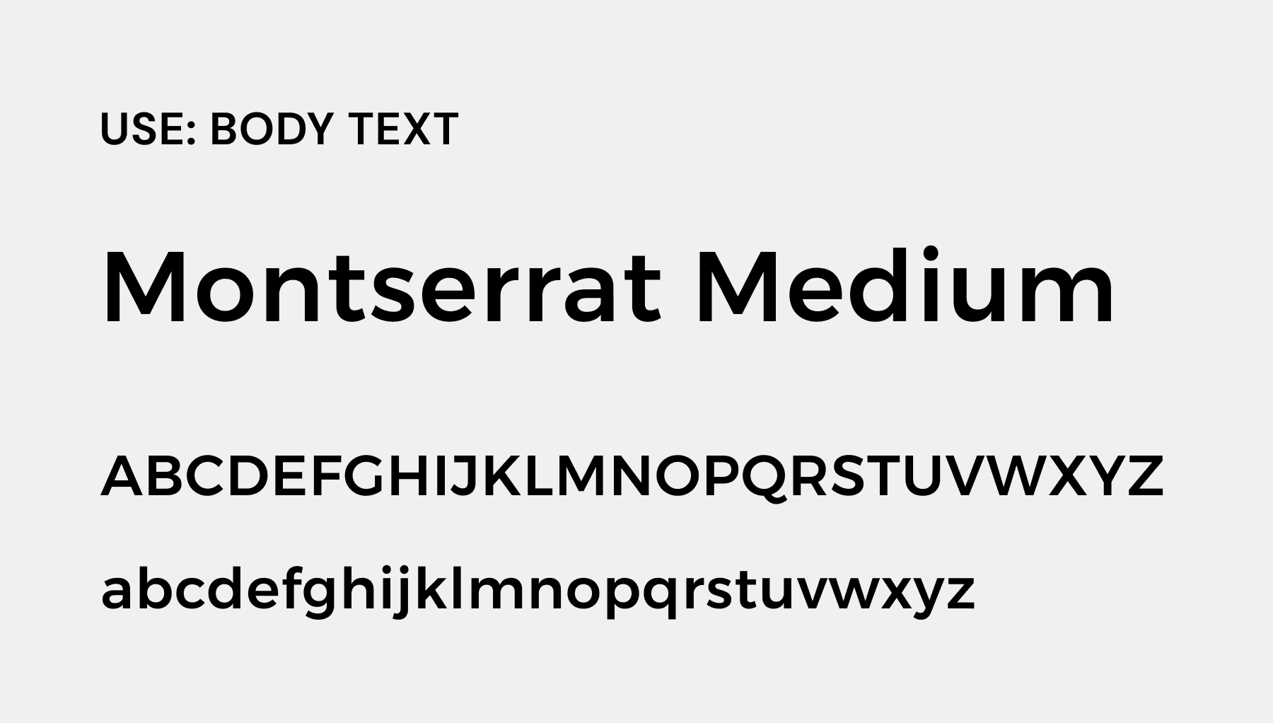
In terms of fonts, I've chose two distinct typographies. The main part employs Phyton Script, a lettering font that imparts a sense of "humanity," adding a personal touch to the design. Additionally, I've incorporated Montserrat for its legibility, even at smaller sizes. The rounded shapes of Montserrat complement the script font, creating a harmonious visual balance. Montserrat will serve as the chosen font for the body text in all other materials, ensuring a consistent and unified presentation throughout the project.
Applications
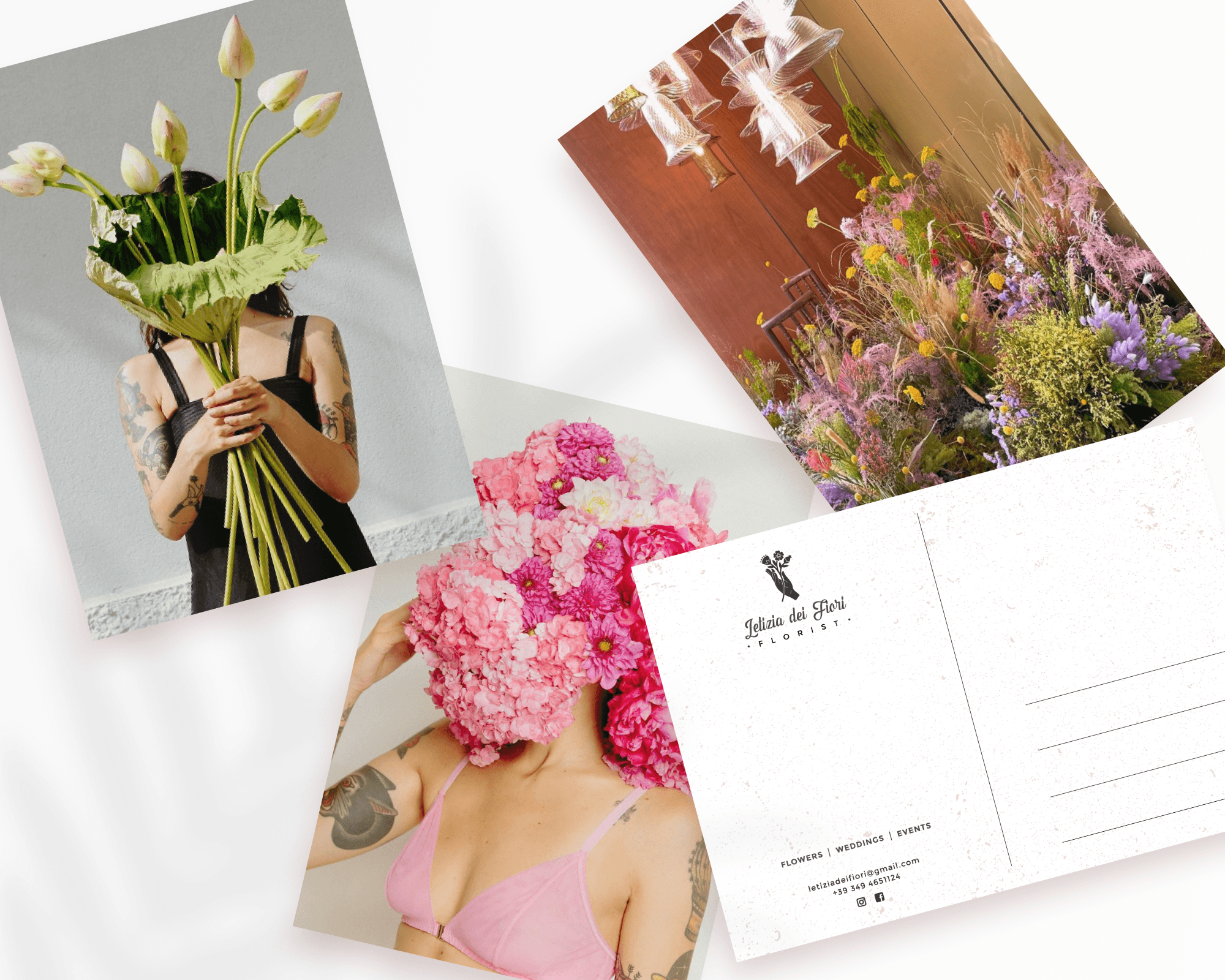
The primary applications of this identity will find their place on social media platforms, business cards, and select promotional postcards.
