Concept

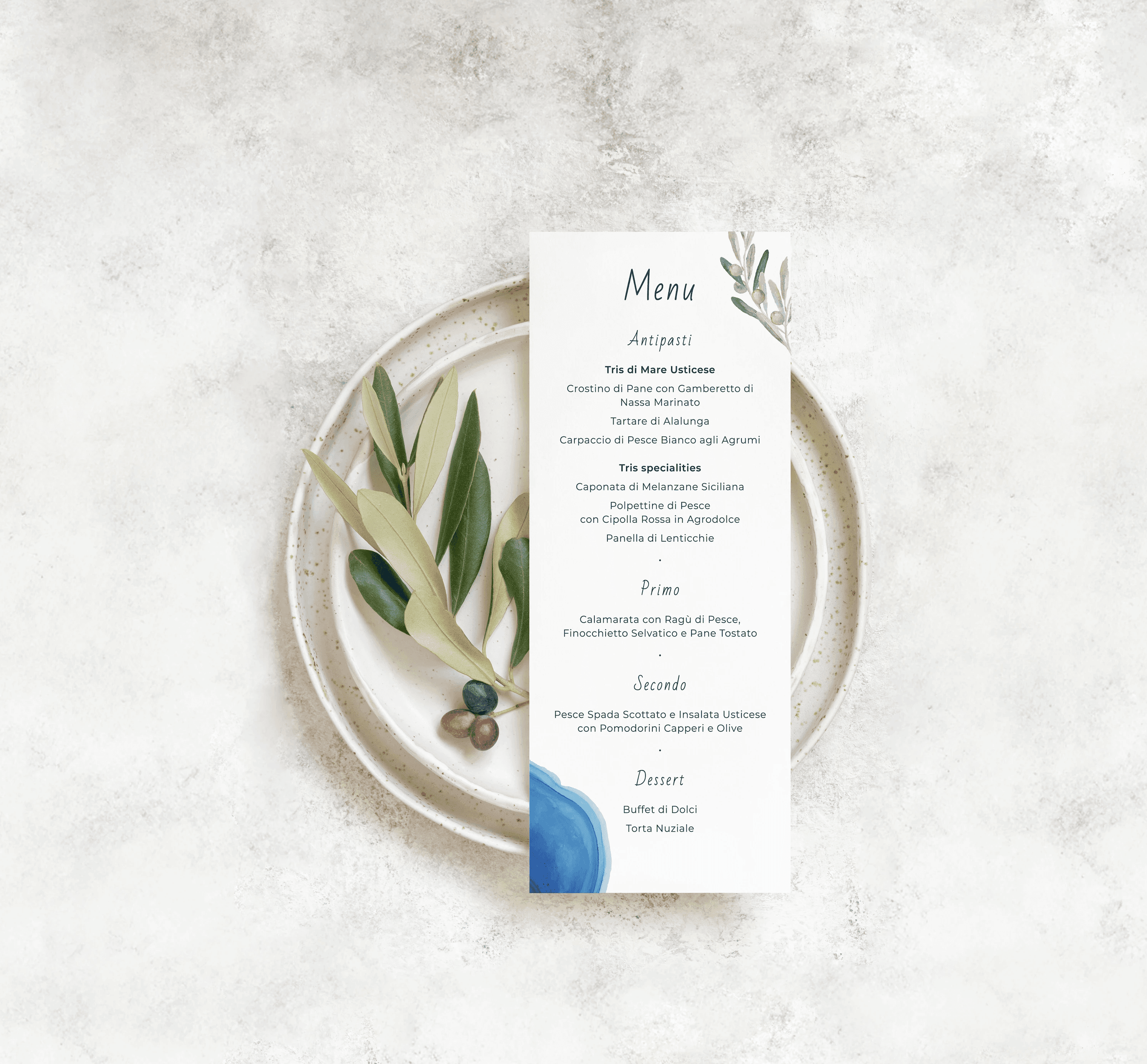
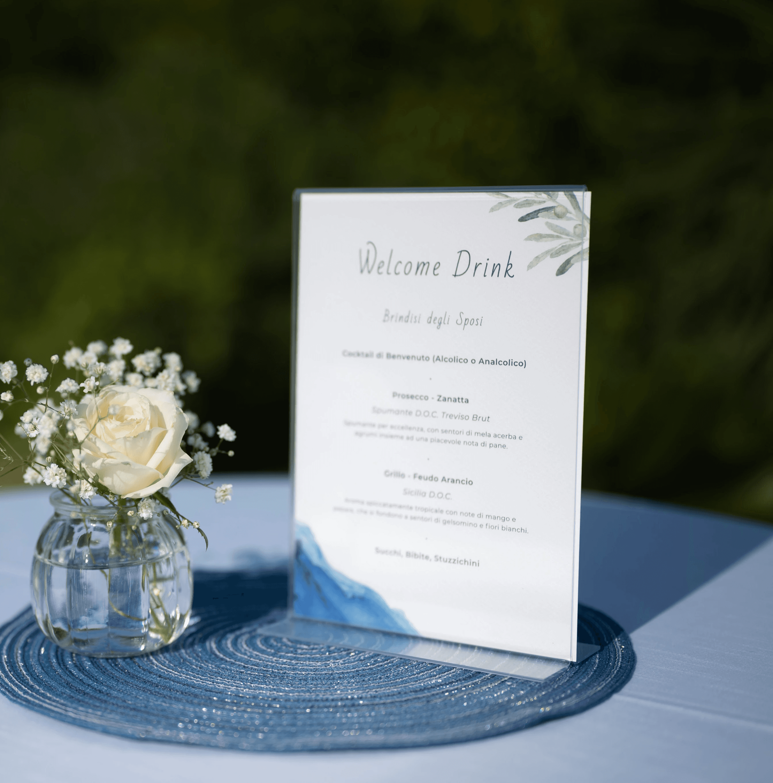
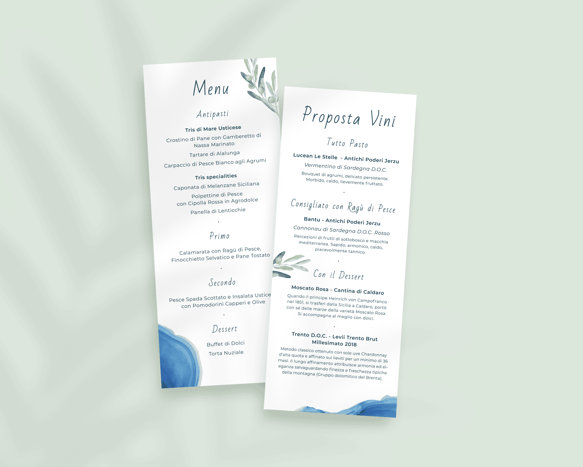
Colour Palette
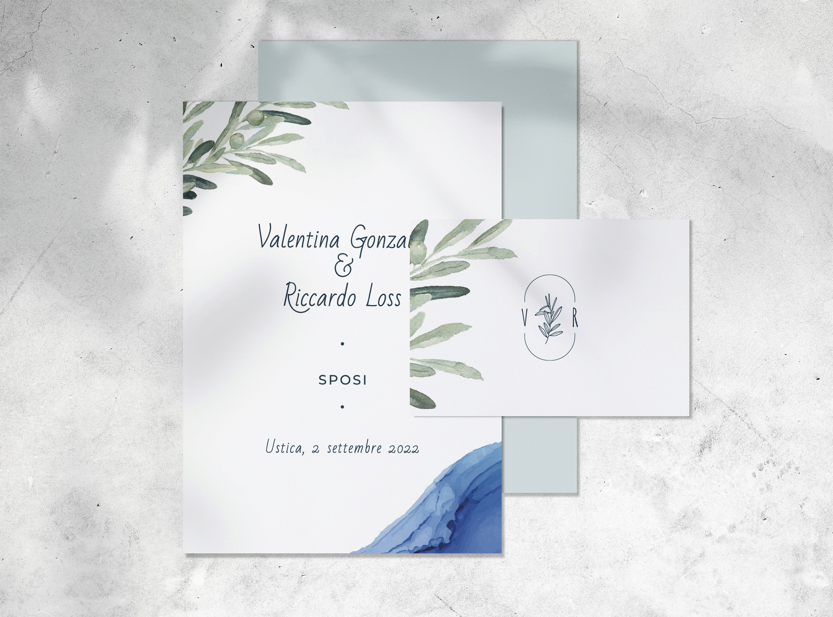
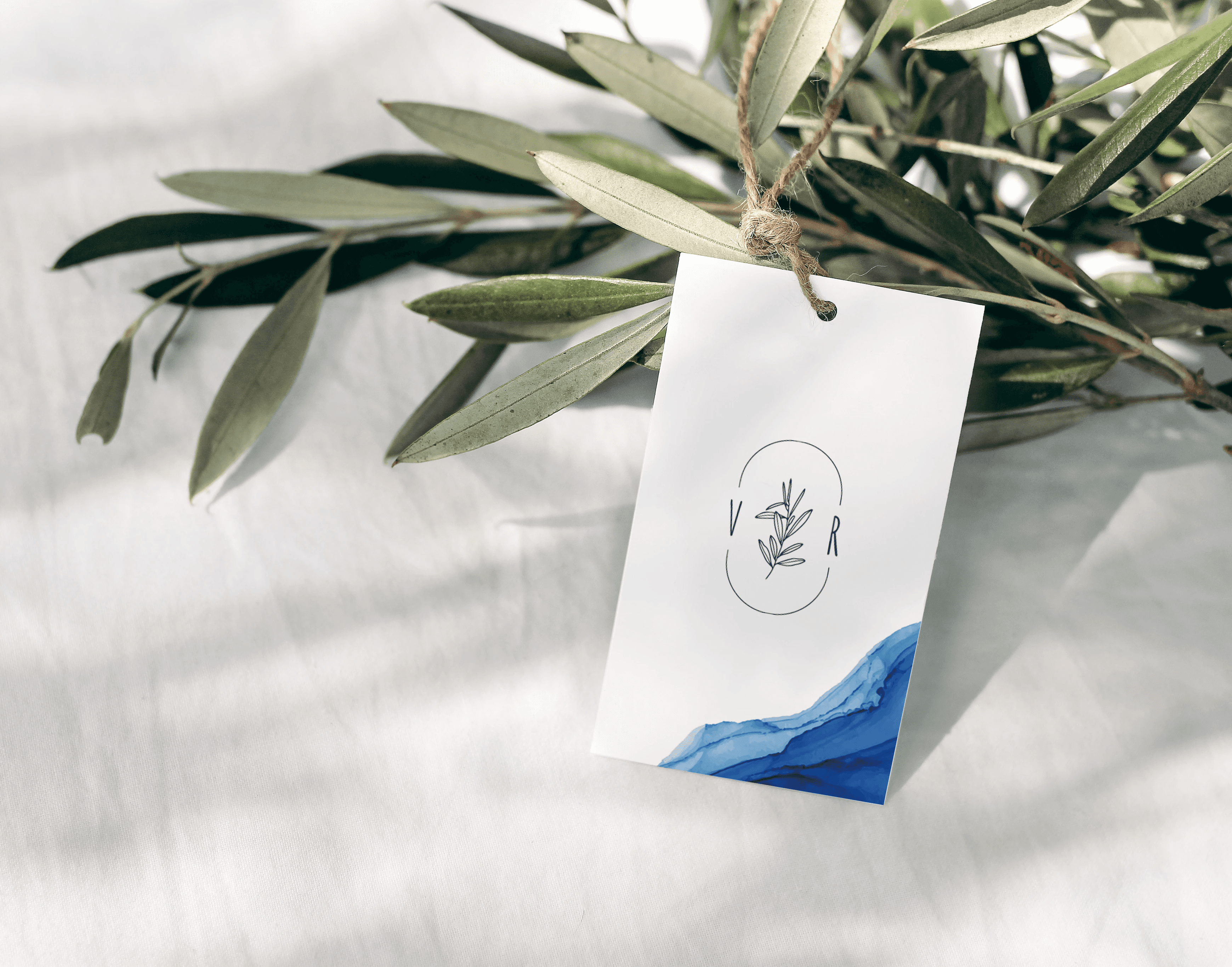
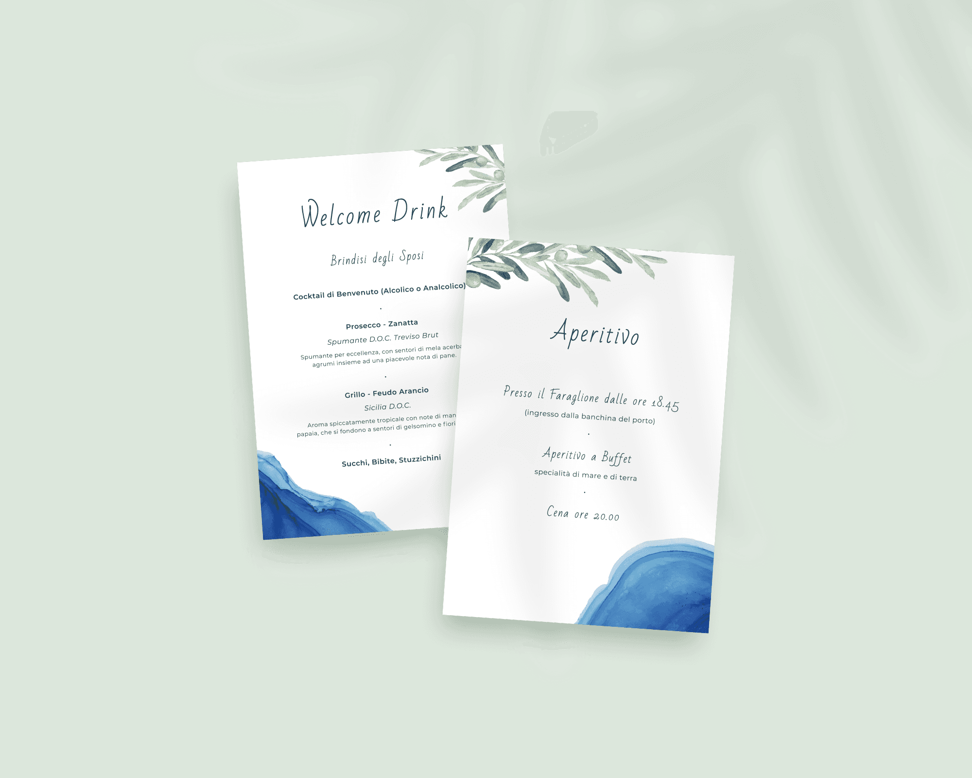
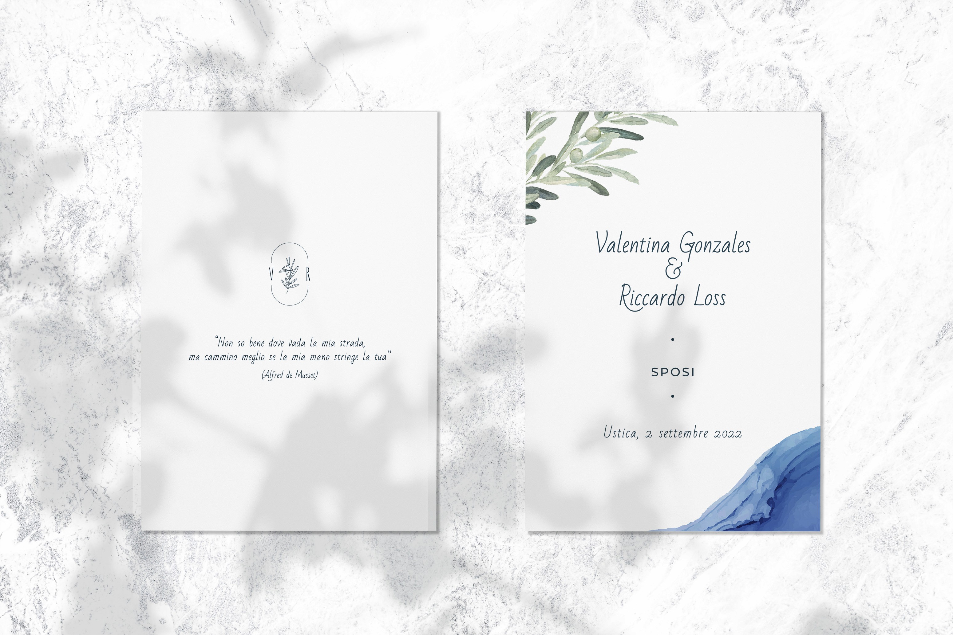
The color palette is dominated by blue and by olive green, referencing the elements described above. All the hues will have pastel tones to convey a feeling of sophistication and elegance.
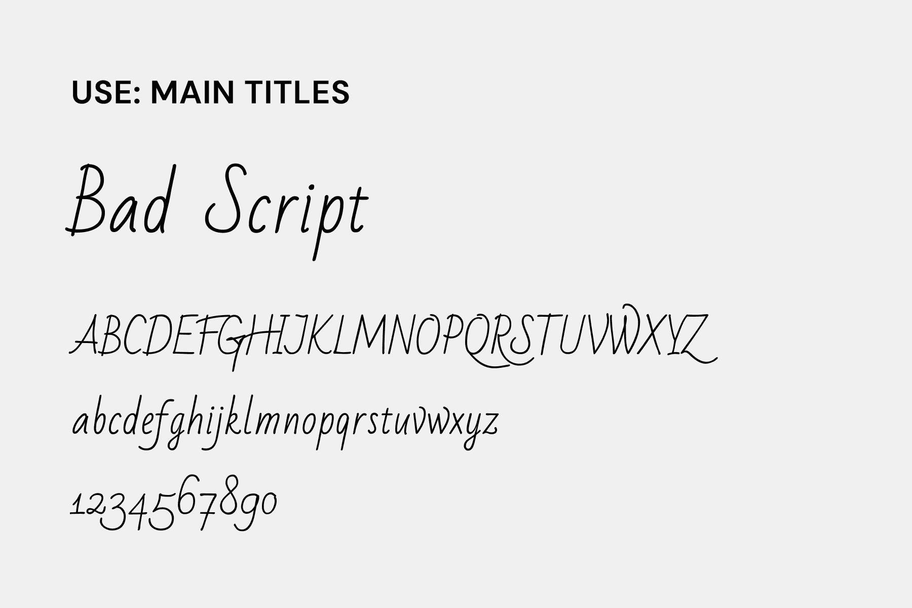
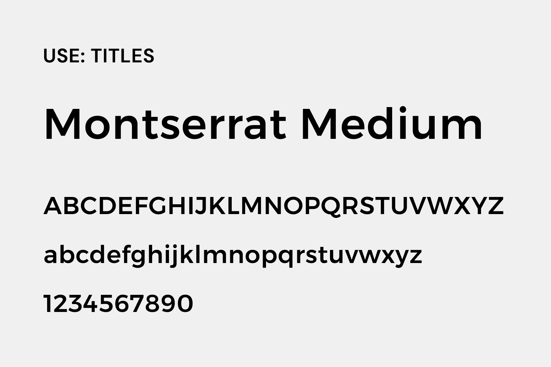
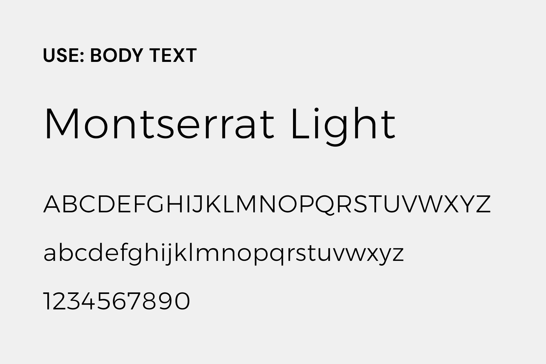
Typography
For the typography, I've combined two distinct fonts. The primary element features Bad Script, a script font applied to main titles, giving an elegant handwritten look. For enhanced readability, especially in smaller text, I've incorporated Montserrat. Montserrat will serve as the main font for body text in all other materials, ensuring a cohesive and consistent presentation throughout the entire project.
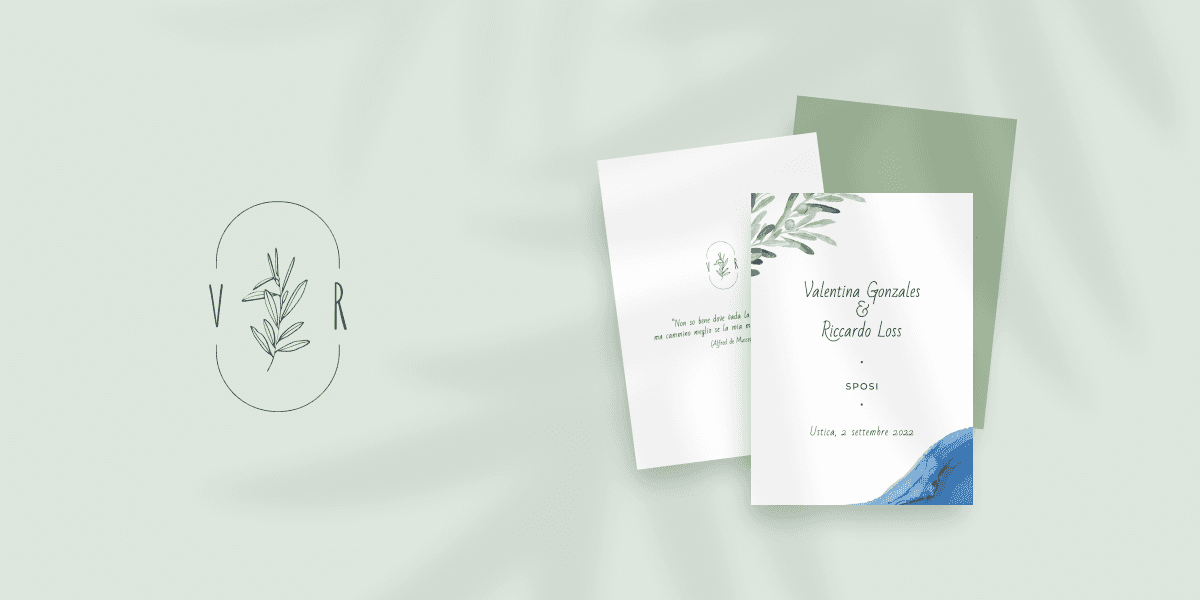
The logo
To enhance the material's identity, I designed a logo which connect the initials of the couple's names by an oval shape. Inside this design, an olive branch symbolically represents their unity.

Applications
The produced materials were all paper-based and specifically included: invitations, announcements, favor tags, three versions of the menu, cocktail cards, the wedding ceremony booklet, and table markers.